Student-Made


The smerg maps were probably my favorite lab all semester -- they're all so silly and cute. I'm still baffled by the inclusion of Gizmo on this one, and I'm still even more baffled by how great Gizmo looks in the corner there. Creative and clever.

The frayed border to the weird ripped paper texture on the counties, this map just makes me smile.
Weekly Post Maps

I can't for the life of me discern what this is without reading about it, but I could look at it for hours. Great find, Kara.

The colors are so bright and pretty but not super hard to understand -- the shape of Antartica is something that's so easily forgotten, this map does a great job of displaying the importance of projections.

This map upsets me as a result of how cool it looks. The feel of surging electricity just resonates through the whole page when you look at it.

Rebecca and I are officially feuding. Why didn't you show me this? I love the look of it, although I resent the need to explain bigfoot away with facts and such. Let the believers believe, it's good for them. Probably.
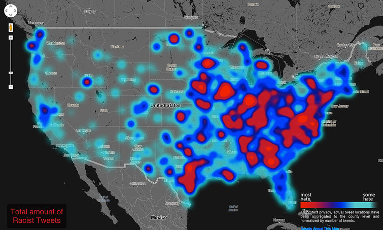
I love love love maps that show spatial trends to data that people wouldn't think of as spatially related (usually internet based.) It's such a good idea, and executed perfectly.

